Product Description
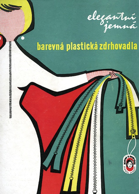
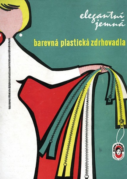
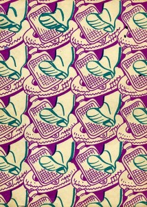
1959 Czech advertisement
The Mid-Century Modern or ‘Less is More’ in book-cover design.
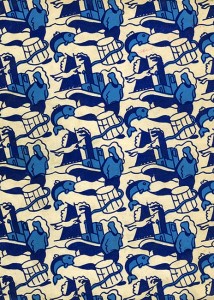
Modernism; pared-down and functional. The Mid-Century Modern style can be applied to architecture, furniture design as well as graphic art and is characterised by a clean simplicity of form. The term, coined in the fifties, roughly covers the period from 1933 to the 1950s but can even perhaps be extended to the 1970s. As with other artistic genres, wonderful examples of the Mid-Century Modern can be found on the covers of books. Central and East European graphic design of the time, is particularly strong in its minimal use of line and, often, the application of bold contrasting colours. Here, powerful graphics, using a limited palette owes much to propaganda poster-art of inter-war Europe, Russia and America.

Reviews
There are no reviews yet.